A practical guide to product photography lighting, soft light, fill light, backlight, reflection control, and difficult materials.
The first time I tried to photograph products, I used my phone and natural light. The results were... passable, I suppose. But they had zero commercial appeal. Then I bought a proper light, and things actually got worse—harsh shadows like knife edges, my ceiling reflected in every bottle, and black products lost all their edges.
I was genuinely puzzled. Why did everyone else's product photos look so clean and professional, while mine looked like they'd been taken in a cupboard?
Eventually I figured it out: the problem wasn't my equipment. It was that I didn't understand how light actually works. Here's what I've learned—the hard way—so you don't have to repeat my mistakes.
The Concepts You Actually Need
Before getting into specific setups, a few terms that genuinely matter. Not jargon for jargon's sake—these directly affect how your products look.
Hard light vs soft light
I didn't understand this at first and used a bare bulb. The shadows were razor-sharp and utterly unforgiving. Hard light comes from a small, distant source—strong contrast, great for showing texture and edges, but merciless on flaws.
Soft light is different. It comes from a large, close, diffused source—gentler shadows, much more flattering, and usually better for ecommerce main images.
The principle is simple: the larger your light source is relative to your product, and the closer it is, the softer the light becomes. Move the light closer, or add a softbox, and it softens right up.
Key light, fill light, and backlight
Your key light is the soul of the image—it determines where highlights fall and sets the overall mood. Fill light sits opposite, lifting shadows without eliminating them entirely. You want depth, not a flat wash of brightness. Backlight comes from behind, creating edge separation so your product stands out from the background.
Diffusion
This is what turns harsh light into soft light. Softboxes, umbrellas, diffuser panels, even tracing paper—anything that spreads and softens the light. The goal isn't more brightness; it's a larger, more even light source.
Reflection management
This is the bit most guides skip entirely. With shiny products, you're not lighting the object—you're designing what it reflects.
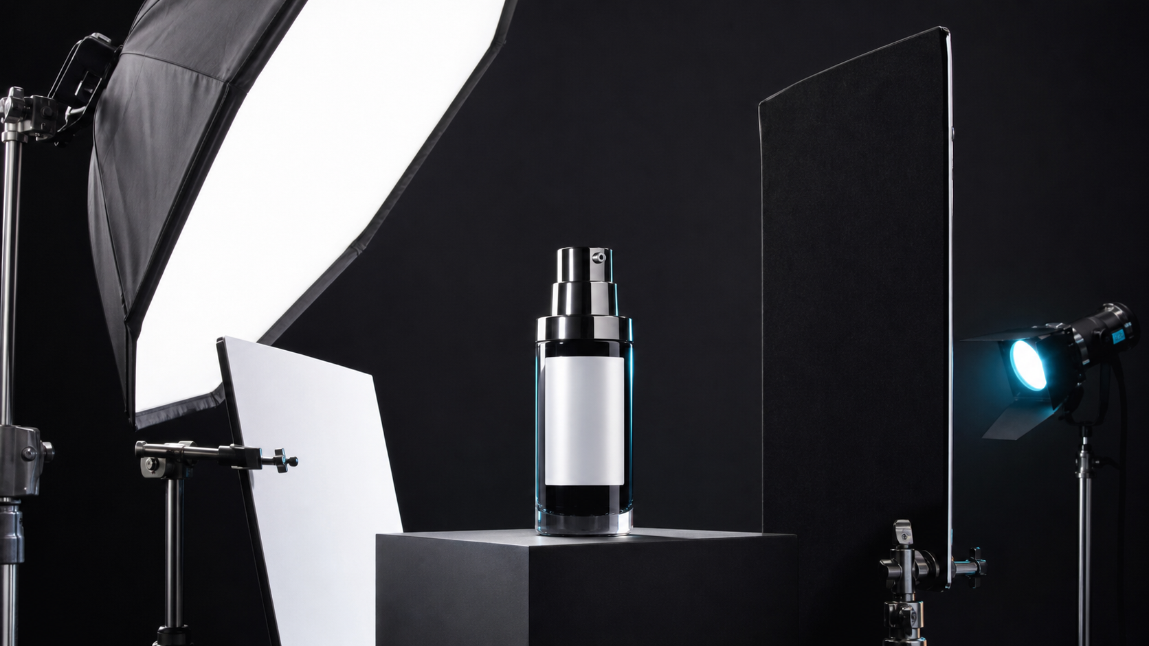
The first time I photographed a glass bottle, the surface showed my entire room—ceiling, windows, even me. I learned later that white cards create clean highlights, and black flags absorb light and carve out edges. You're essentially sculpting the reflections.
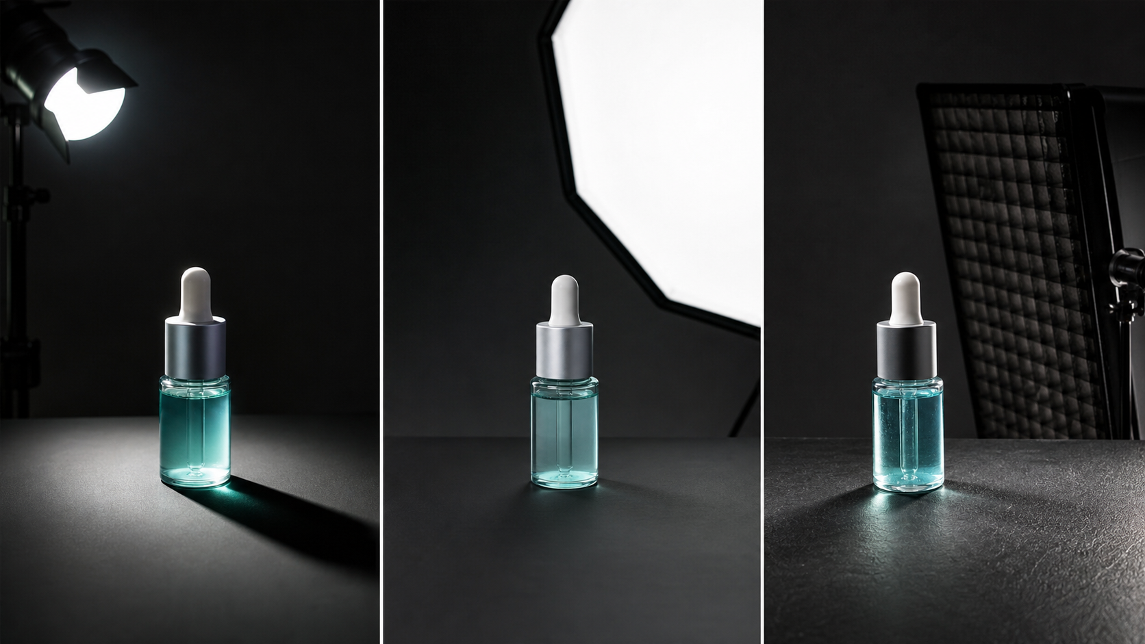
Six Lighting Setups (And When Each One Works)
Window light
The cheapest starting point. Natural, soft, and free. I started with window light, and honestly, the results weren't bad.
The problem? It's inconsistent. A cloud drifts across and the light changes. Morning and afternoon have different colour temperatures. Overcast and sunny are two completely different worlds. Fine for lifestyle content and learning, but not ideal for consistent catalogue work.
One-light setup
A single softbox with a reflector on the opposite side. This is where you learn the most, because it forces you to understand how light direction, diffusion, and fill cards work together.
The first time I shot cosmetics with a single light, the results genuinely surprised me. One light at 45 degrees, white card as fill—the images looked better than anything I'd managed with natural light.
Two-light setup
The most practical for most sellers. Key light for shape, second light (or a strong reflector) for fill or rim. More control without overcomplicating things.
This is what I use day-to-day now. It handles nearly everything, from packaging to clothing.
Three-light setup
Key light for shape, fill for shadows, backlight for separation. The standard for professional catalogue work, especially clothing.
Here's a pitfall though: it's easy to over-light. I once shot a batch of clothing with all three lights blazing, and the images looked flat and lifeless—no depth at all. Turning the fill down a notch made an immediate difference.
Light tent / lightbox
Great for jewellery, small shiny objects, and high-volume catalogues where you need even, shadow-free results quickly. The downside? Images can look flat and lack the drama of a carefully lit shot.
Side lighting
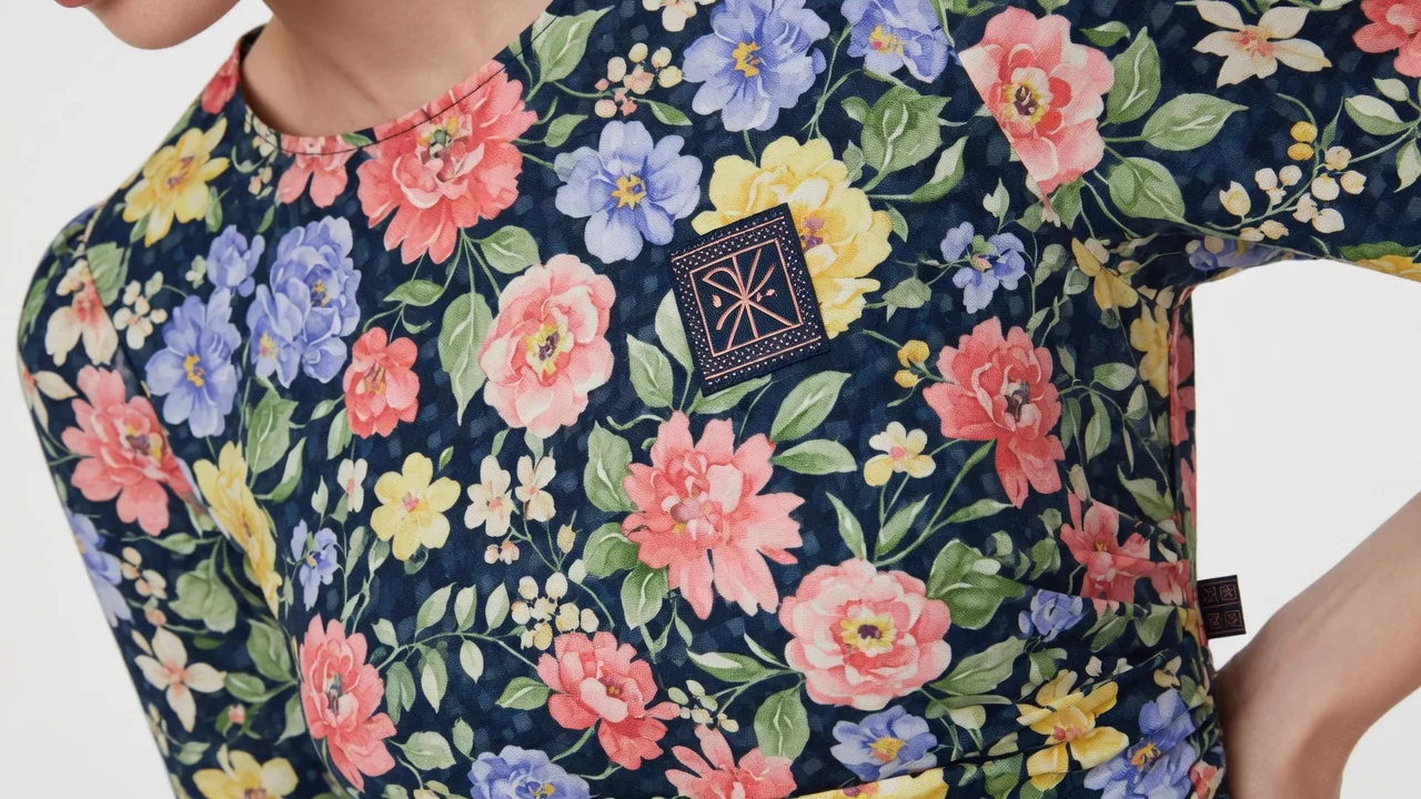
Particularly effective for textured surfaces—fabrics, embossed packaging, metal finishes. The angle reveals texture that front lighting completely flattens out.
I once shot a batch of knitwear with front lighting and couldn't see the stitch pattern at all. Switched to side light, and suddenly every cable and rib was visible.
How to Light Specific Products (Learning From My Mistakes)
This is where most generic advice falls short. Different materials need completely different approaches, and I've learned each one the hard way.
Glass bottles and transparent packaging
The biggest mistake? Lighting from the front. I photographed some essential oil bottles with front lighting once—the surface was just a flat white mess. No transparency whatsoever.
Transparent objects need backlighting to create edge highlights and that translucent glow. Add a soft front fill just for the label. Use large diffusion panels to create clean, continuous highlights along the edges.
One more lesson: dust and fingerprints show up mercilessly. I once finished an entire shoot only to discover a fingerprint on the bottle. Had to redo the lot.
Cosmetic packaging
A single large, soft light source at roughly 45 degrees works well. Use white cards to fill shadows gently—you want smooth gradients on glossy surfaces, not harsh specular highlights blowing out the logo.
The goal is "clean, expensive, readable." I once had highlights so strong the logo was completely invisible. Added a diffusion panel, problem solved.
Metal and reflective products
This is where I've made the most mistakes. The key insight: you're not fighting reflections—you're controlling them.
I once spent an afternoon trying to eliminate reflections from a set of stainless steel thermoses. The harder I tried, the worse it got. Then I switched to side lighting with white cards, creating clean, intentional highlights. The result was actually better than what I'd been trying to achieve.
Black foam boards work brilliantly as flags—they absorb light and carve out edges, giving definition to chrome, steel, and polished surfaces.
Clothing and textiles
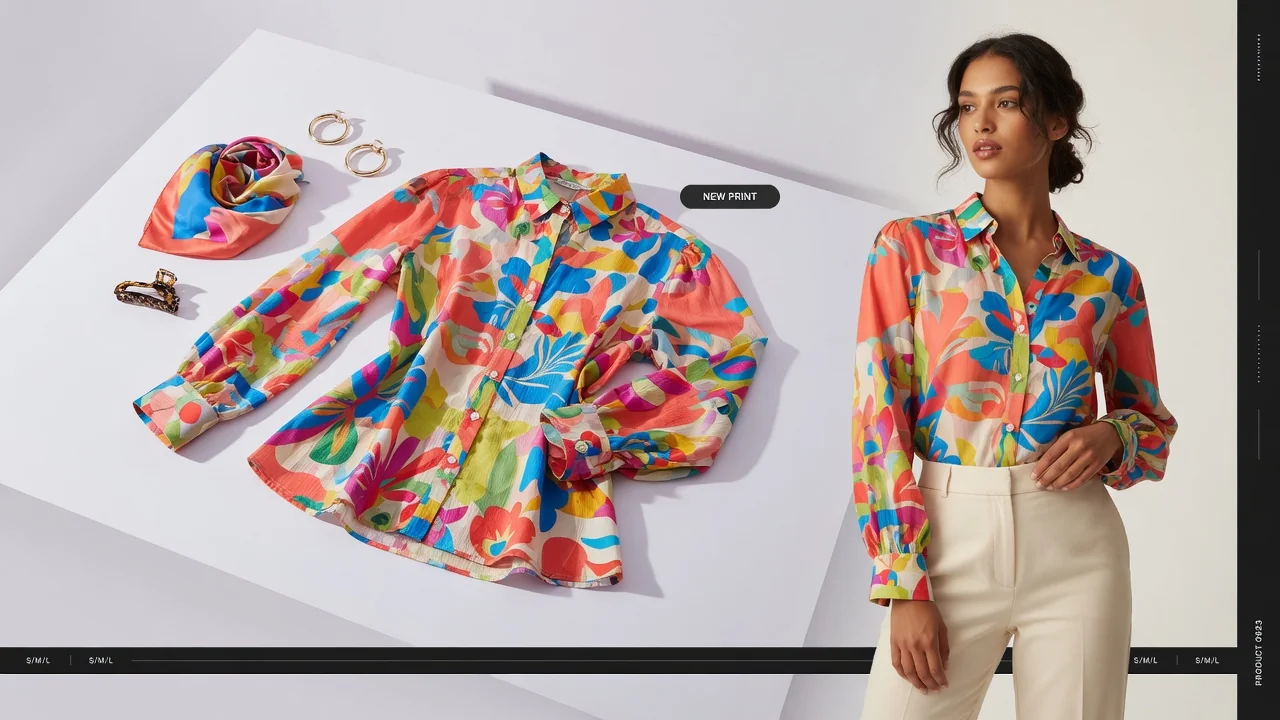
A three-light setup is most reliable. Key light to shape the garment, fill to soften shadows, backlight to separate from background.
For showing texture—knitwear, embroidery, woven fabrics—add a directional side light. Fabric texture comes from shadows and highlights, not from even lighting.
White products on white backgrounds
The challenge isn't brightness—it's separation. I once shot a set of white ceramics and the products simply vanished into the background.
Use a reflective box (white foam boards arranged around the product) to create soft, even illumination, but keep the background slightly different in tone. Light the product and background separately if needed.
Black products
The opposite problem: everything disappears into shadow. I photographed some black electronics once with front lighting—the edges disappeared completely and the products looked like black blobs.
Switch to rim lighting from behind to define the edges, plus controlled fill to reveal just enough detail. Sometimes a mid-grey background works better than pure white or black.
Food packaging
Front-facing readability is essential—the label needs to be clear. But you also want some dimension, so a slightly directional key light at 45 degrees with a reflector for fill works well.
I shot some snack packaging once and it looked completely flat—couldn't see the shape or seal at all. Added some side lighting and suddenly the embossing and seal details popped.
Jewellery and small objects
A light tent or lightbox gives you quick, even results with minimal fuss. For hero shots with more personality, add a small directional highlight through the tent opening.
One painful lesson: clean everything obsessively. I shot a ring, and when I zoomed in afterwards, it was covered in dust particles. The entire set was unusable.
Common Lighting Problems (And How I Fixed Them)
"My shadows look harsh"
Your light is too small, too far away, or not diffused. Move it closer and add a softbox roughly the same size as your product. The shadows soften immediately.
"The label is unreadable"
You've used backlighting without adding front fill. Keep the backlight for edge definition and translucency, but add a soft light or white card at the front.
"Black products have no edges"
You've tried to light the front evenly, which kills the edge definition. Use rim lighting from behind instead—you want the edges to glow slightly against the background.
"White products disappear into the background"
The product and background are too similar in brightness. Light them separately, or use a slightly off-white background. White products need just enough edge contrast to be visible.
"I can't see the fabric texture"
Your light is too flat and too frontal. Texture comes from directional side lighting—position your light to the side and slightly above, so the shadows reveal the weave, stitch, and fibre.
"My bottle shows everything in the room"
You're photographing the room's reflection, not the bottle. Control the environment: use large diffusion panels as your "light sources," and black flags to eliminate unwanted reflections. You're designing what the bottle reflects.
Colour Accuracy (A Painful Lesson)
Colour accuracy isn't just about white balance—it's a chain.
CRI (Colour Rendering Index) measures how accurately a light source renders colours compared to natural light. Aim for CRI 90+; 95+ is better. I learned this the hard way: two lights at the same colour temperature but different CRI values made my products look different colours.
Colour temperature (CCT) describes whether light looks warm or cool. Don't mix different colour temperatures in the same shoot.
Monitor calibration is the step most people skip. I skipped it too, and the images looked completely wrong on my client's screen. They complained about colour discrepancy. Spent £30 on a calibration device, problem solved.
What You Actually Need at Each Budget Level
Good photos don't require expensive gear.
Low budget
One decent light with diffusion, a white card, and a black foam board. That's enough for a single-product hero shot. Light at 45 degrees, white card as fill, foam board to control shadows.
That's exactly how I started—cost me less than £60, and the results were leagues ahead of my natural light attempts.
Mid-range
Two controllable lights with high CRI, plus softboxes. This handles most product types and keeps things consistent.
Professional setup
Three or more lights with precise control, large modifiers, and a full set of flags, reflectors, and diffusion panels. For high-volume catalogues where consistency matters.
The key insight: it's not about having more lights—it's about having more control.
Getting Lighting Right for AI-Generated Scenes
If you're using AI tools to generate backgrounds or studio scenes, the original lighting still matters enormously.
AI can extend good lighting, but it can't fix bad lighting. If your source photo has harsh shadows, inconsistent colour, or unclear edges, the AI-generated scene will inherit those problems—or make them worse.
Get these right before you even think about AI:
Light direction: Make sure your product photo has a clear, consistent light direction. The highlights should make sense with whatever background the AI generates.
Contact shadows: Keep the shadow where your product meets the surface. Without it, the product looks like it's floating.
Edge definition: Transparent, black, and metallic products need clear edges. If the AI can't see where the product ends, it won't generate a believable scene.
Colour consistency: Use a consistent white balance and colour temperature. This makes it much easier for AI tools to match your product with generated backgrounds.
A quick note on ProductShotAI—it can generate white background, studio, and lifestyle scenes from your existing product photos, but only if your source images have clear light direction, clean edges, and readable labels. AI extends good lighting; it can't rescue bad lighting. So rather than hoping AI will fix your mistakes, get the basics right first, then let AI help you scale efficiently.
Final Thoughts
Good product lighting isn't about having the fanciest equipment. It's about understanding three things: the direction of your light, the size of your source relative to your product, and how to control reflections.
It took me two years to get here—from shooting with my phone and natural light to consistently producing clean, professional-looking product images. I made plenty of mistakes along the way, but each one taught me something.
Start with a single soft light and a reflector. Learn how moving it changes the shadows and highlights. Then experiment with side lighting for texture, backlighting for glass, and rim lighting for dark products.
The best product photographers aren't the ones with the most lights—they're the ones who understand what each light does and why. You don't need to get there overnight. Just keep experimenting, one setup at a time, and the feel for it will come.